Hills + Sons Identity
and Packaging
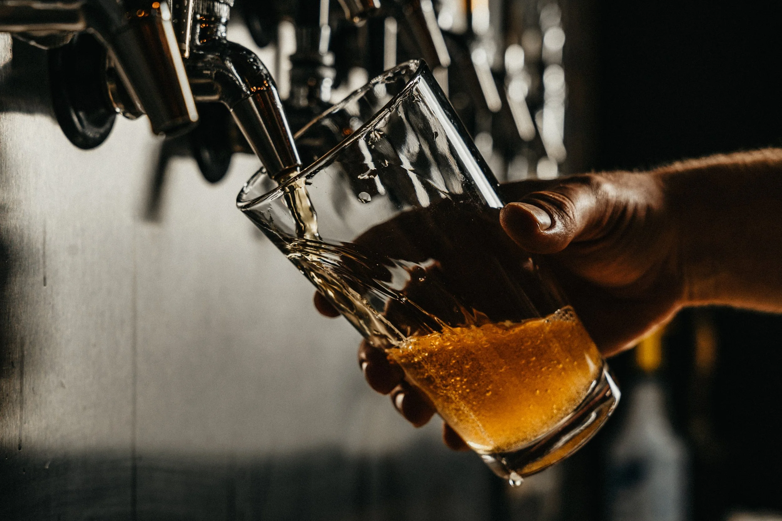
For those who have a refined taste for quality over quantity.
Hill & Son’s is handcrafted with fresh and local ingredients, creating a daring and refreshing taste that contrasts against any other craft beer.
Hills + Sons products focus on creating an enlivening experience, refreshing your pallet while sponsoring local orchards and farms.

Primary Identity

Secondary Identity
With the primary logo, focusing on ingredients was key. Utilizing the principle of balance, I illustrated a hop icon that is symmetrical on both sides, to match the symmetry of the letter H.
The points of the serif compliment the points within the hop icon. The stem of the capital H creates visual leading lines toward the hop, further pushing the focal point within the logo. This leads the viewers’ attention directly to the hop.


